


Just the PeaksThis newsletter at a glance
|
Did you know that certain colors and combinations lead to higher rents?
Walk into a person’s home, and you instantly notice their choice of bold, fiery red, or perhaps a cool, calming blue. Color is not only a reflection of an individual’s unique personality and preference. It also dictates the mood and energy level of a room.
The problem is, renters do not always get to enjoy the same creative freedom as homeowners. Prospective tenants have to judge someone else’s decorating decisions when searching for their dream unit. And many of them have very specific tastes.
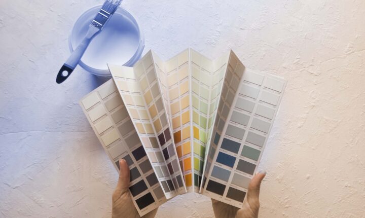
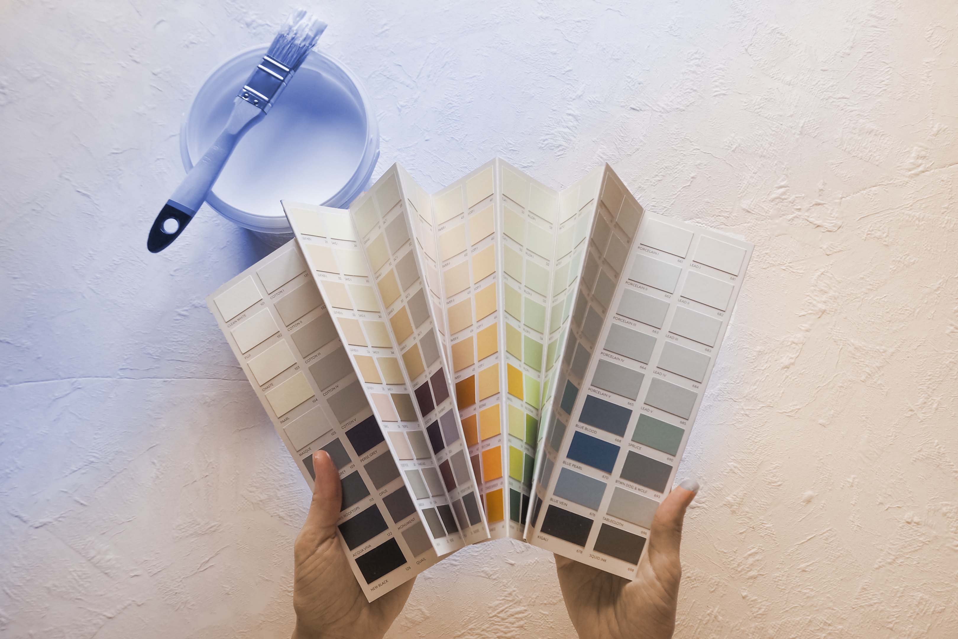
Therefore, landlords should consider the most universally pleasing colors and color combinations when renovating a rental home or apartment. You want to appeal to the masses while exuding cleanliness and cohesiveness in your marketing. And when executed properly, a smart color scheme will also save you money in the long run.
Certain colors can read both timeless AND trendy, depending on the room.
Pro tip: keep it neutral
Today’s leading interior designers and real estate professionals agree that neutral colors are most desirable. White walls exude spaciousness, while warm beiges, grays, and khakis—even muted yellows and greens—also attract tenants in a positive way.
According to Green Residential, “The first thing you will need to know when painting a home is that a neutral palette is best. Secondly, and more importantly, neutral does not always mean white. Neutral color palettes can range from muted pinks to pale yellows, but don’t usually include heavily saturated colors.”
Furthermore, ‘neutral’ doesn’t have to mean safe or boring. When forming a cohesive color scheme, designers tend to keep the majority of the room indistinct by choosing cream-colored walls, ashen grey tile, or natural hardwood floors. Then, they add visual interest through accent colors—an unexpected pop of blue, black, or green.
Color Psychology 101
Before choosing a primary and/or secondary paint color, take inspiration from your environment. Factors like state, geography, and climate help contribute to the ‘vibe’ of a space and what colors feel right at home.
Lena Borrelli of MyMove.com writes, “Certain colors or even groups of colors tend to receive a common reaction from people, which is why it’s important to choose wisely when it comes to decorating.”
Orange for energy
Yellow for happiness
Pink for creativity
Green for reassurance
Blue for calming
Purple for drama
Brown for traditional comfort
Grey for modern comfort
White for spaciousness
Black for edginess
Metallics for excitement
For more inspiration, visit MyMove.com
Picking the perfect pair
Clearly, color plays a powerful role in the desirability of your rental unit. But are you feeling color clumsy? Don’t worry—Everest has you covered.
From walls, ceilings, and floors to bathroom tile, fixtures, and finishes, our following picks strike an ideal balance of trendy and timeless.
Top 5 Color Combinations to Attract Tenants
- Cream + Wood
Mood: warm, organic, relaxing
Best for: living room, kitchen, studio apartments
Attracts: starting-out singles, naturalists, creatives
Bonus 3rd color: emerald
- Sand + Dark Gray
Mood: comforting, cozy, dependable
Best for: dining room, bedroom, entryway
Attracts: women, traditionalists, married couples
Bonus 3rd color: teal blue
- White + Stone Blue
Mood: open, natural, calming
Best for: kitchen, bathroom, bedroom
Attracts: men, millennials, beach lovers
Bonus 3rd Color: black
- Black + White
Mood: clean, elegant, focused
Best for: bathroom, office, laundry
Attracts: at-home workers, bachelors, modernists
Bonus 3rd Color: red or yellow
- Yellow Beige + Gray
Mood: cute, friendly, approachable
Best for: kitchen, living room, bedroom
Attracts: young families, students, seniors
Bonus 3rd Color: white
Everest says: make your colors count